Nowadays, most people have a halfway decent camera in their phone. For this article, you won’t need anything better than that. A lot of photography is choosing interesting subject matter, and framing it in a complementary way.
COMPOSITION
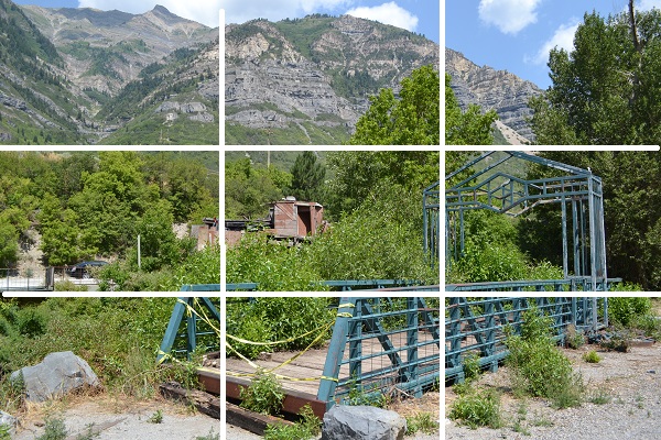
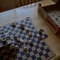
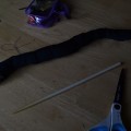
When you take a picture, you frame a piece of reality. One rule of thumb is to imagine a tic tac toe grid in the viewfinder. Try to line up elements along those lines; it makes the picture seem better proportioned if you do. As you place elements on the intersections of the grid, it lends them greater visual importance. Compare the following:
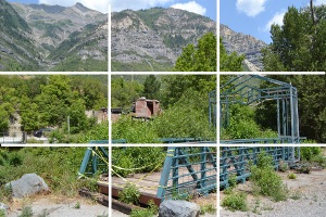
To be fair, the second picture has rather more going for it. It has a nice amount of detail to keep the viewer from getting bored, and a more cohesive composition. Notice how different elements subtly focus the eye on the right with converging lines.
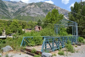 Much like in the drawing article, part of getting good at photography is seeing the lines and shapes in the real world. When you look at something, pay attention to how your eye shifts its focus along a path, and try to capture the sum of the movement in the frame.
REDUNDANCY
One of the secrets of photography is to take a lot of pictures, variations on the subject matter. Tilt your camera, landscape and portrait, close up and far away. You may find yourself crouching in odd places, or slowly stepping out into the middle of the street to get that perfect angle and distance. Be careful and considerate; you don’t want to die and some people can get territorial about their yards. Ignore the people who may be laughing at you, and be sure to get permission to take pictures inside public buildings.
Once you have a goodly amount, then you can get down to winnowing them. This is a good time to edit your photos; if you are serious about photography, there are various programs where you can adjust the light and shadow levels, among other things. That is pretty useful, but you can at least crop and/or resize things in Paint. Cropping is a good way to salvage a photo. Let’s take one from earlier, the first one with the grid treatment.
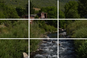
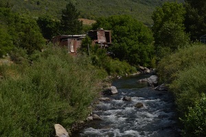 The original has a lot of bland foliage just taking up space. If we crop it to include the whole of the building and the stream, we still end up with that foliage a little too prominent. The solution is to crop more aggressively. One nice thing about cropping is that you aren’t bound by any particular set of dimensions. Thus, the landscape photo can be cropped to be any rectangle. First, a more portrait-oriented crop:
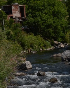 Here, the eye is drawn along a z path from the stones up the river and to the shack. This is pretty good, but you may notice the quality of the picture is lower than the original. This is the drawback of cropping; you get more detail zooming in on the camera than in the photo editor. I was unsatisfied with this picture, so I tried a different crop.
A longer, thinner rectangle eases the back and forth eye motion, 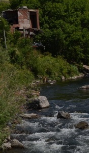 making for a more stable-feeling composition. Notice as well how the river and the greenery take up roughly equal amounts of the picture, a bit like the yin yang symbol. Balance part of good composition and may take some minor cropping to achieve.
Ultimately, these are all guidelines. What matters is that the picture looks good to you. As art, it can be necessary to break from the conventions to achieve a unique composition. As a memory supplement, family photos don’t have to be focused on aesthetics. Take pictures, and show the world what your point of view.
Brandon is originally from Olmsted Falls, Ohio. He has studied both at Baldwin Wallace college and Brigham Young University, and is currently pursuing Chemical Engineering, among other things. He considers himself a jack of all trades, and a master of none. In his spare time, Brandon enjoys knitting, guitar, reading, origami, writing, and photography.

